AI-Native Senior Product Designer · Personal project · 2026
A site that answers recruiter questions itself, with no framework, no backend, and no API key.
Instead of a static gallery, I built this site as an AI-style product: Brix, a conversational concierge whose retrieval engine runs entirely in your browser. Every part — the app-shell UI, the engine, the design system, the accessibility architecture — is hand-built vanilla HTML, CSS, and JavaScript, then audited the way I'd audit a product.
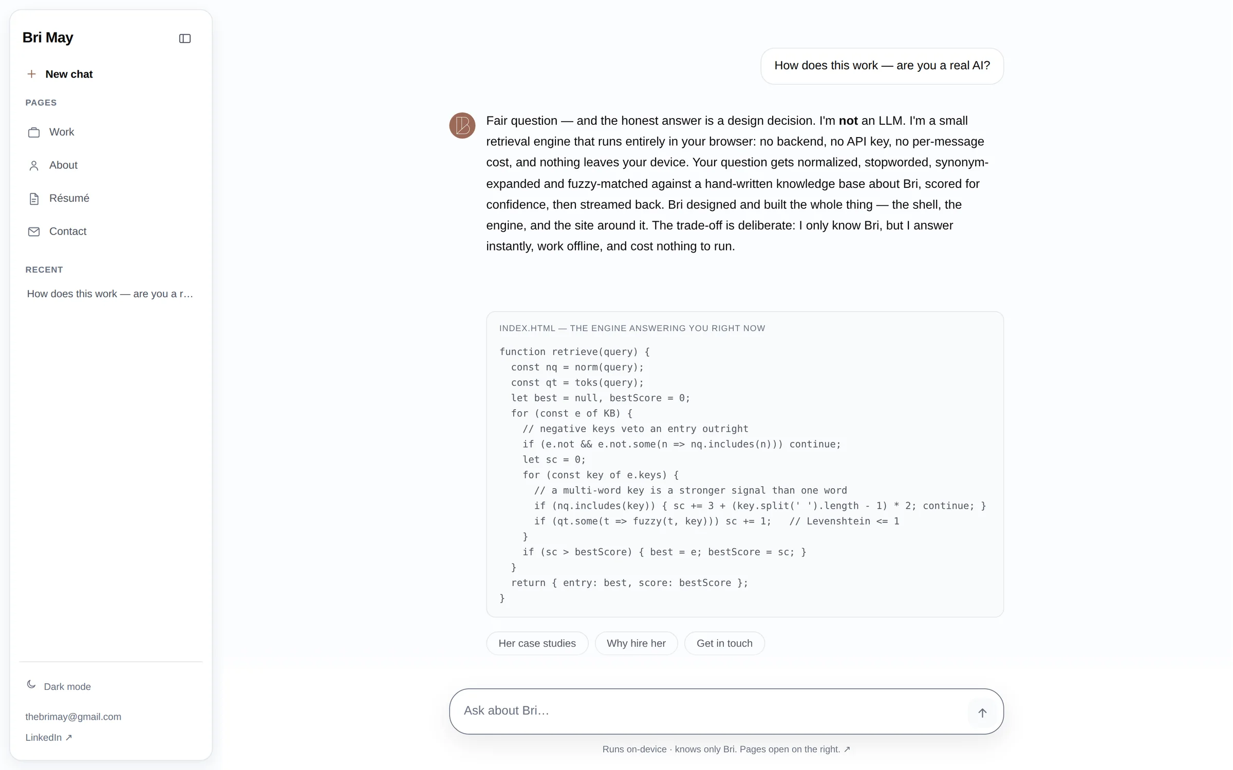
A portfolio should prove its claims. So instead of saying I ship code on a static page, I built the page and put the source next to it: a three-column LLM-app shell with a chat concierge whose answer engine — tokenization, synonym expansion, fuzzy matching, confidence scoring — runs on-device in plain JavaScript. No framework, no build step, no server, no key. Then I audited it like a product: 38 real screening questions, 42 browser-verified checks, WCAG AA in both themes.
- Role
- Designer & Engineer — everything
- Timeline
- 2026 · evenings and weekends
- Team
- Solo
- Scope
- Product framing · UX/UI · Engine · A11y · QA
Product, design, engine, accessibility, and the audit — end to end
Reframed the portfolio from a gallery into a product with a job: get a recruiter from question to evidence in seconds — chat for the questions, an artifact-style side panel for the evidence.
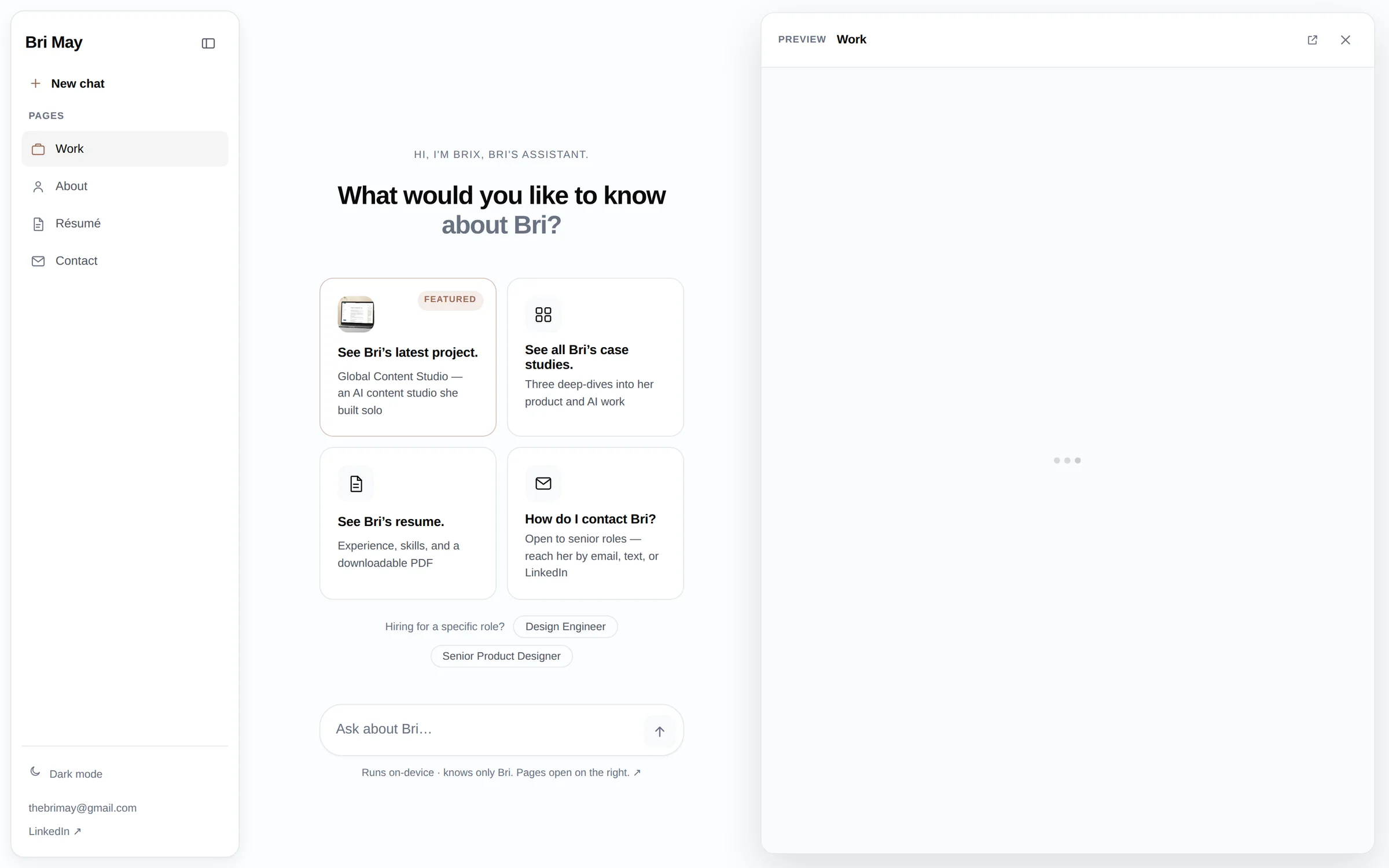
The full app shell — floating rail, chat pane with streaming and stop, side panel with focus management, mobile drawer, first-run action cards, and a role lens for the two audiences that hire me.
A keyless retrieval engine: normalize → stopwords → synonyms → fuzzy match (Levenshtein ≤ 1) → confidence score, with negative keys and multi-word weighting. Hand-written, tested against 38 real screening questions.
Not a pass at the end — the architecture: AA tokens in both themes, streaming that announces once instead of 87 times, skip links, keyboard-complete flows, and a full no-JavaScript version.
Drove every page and feature in a scripted browser — network, layout at 320–1440px, contrast, live-region behavior, downloads — and fixed every one of the 12 defects it surfaced. 42/42 green.
A recruiter gives a portfolio 90 seconds. A claim isn't proof.
Every senior portfolio says "systems thinker" and "ships quality." None of it is checkable in the time a screener actually spends. And the obvious fix — bolt on an AI chatbot — means an API key, a backend, latency, cost, and an illusion that breaks the moment an interviewer pokes it. I wanted the opposite: a site where the engineering claims are the site, inspectable in DevTools, honest about exactly what it is.
An AI product with no AI bill — honest by design
Brix looks and feels like a frontier chat product — streaming tokens, a thinking state, a stop button, follow-up chips, deep-linkable answers. Underneath, it's a deliberate constraint worn proudly: ask it if it's a real LLM and it explains its own retrieval engine, then shows you the code.
On-device retrieval, zero cost. Questions are normalized, stop-worded, synonym-expanded, and fuzzy-matched against a hand-written knowledge base, scored for confidence. Negative keys stop "case study" from matching the education entry; multi-word matches outrank single words. Nothing leaves the visitor's browser.
The LLM feel, honestly earned. Token streaming with punctuation-aware pacing, a variable thinking delay, stop-to-finish, one-turn memory for follow-ups, and a graceful fallback that offers the three nearest topics it does know instead of a dead end.
Evidence one click away. Internal links open in an artifact-style side panel — an iframe with focus managed in and back out, Esc to close — so the conversation never loses its place while the case studies load beside it.
The source, in the answer. Ask whether Bri codes and the answer renders the engine's actual source in the chat. Every answer is shareable via ?q= deep links — a recruiter can send a hiring manager straight to a specific answer.
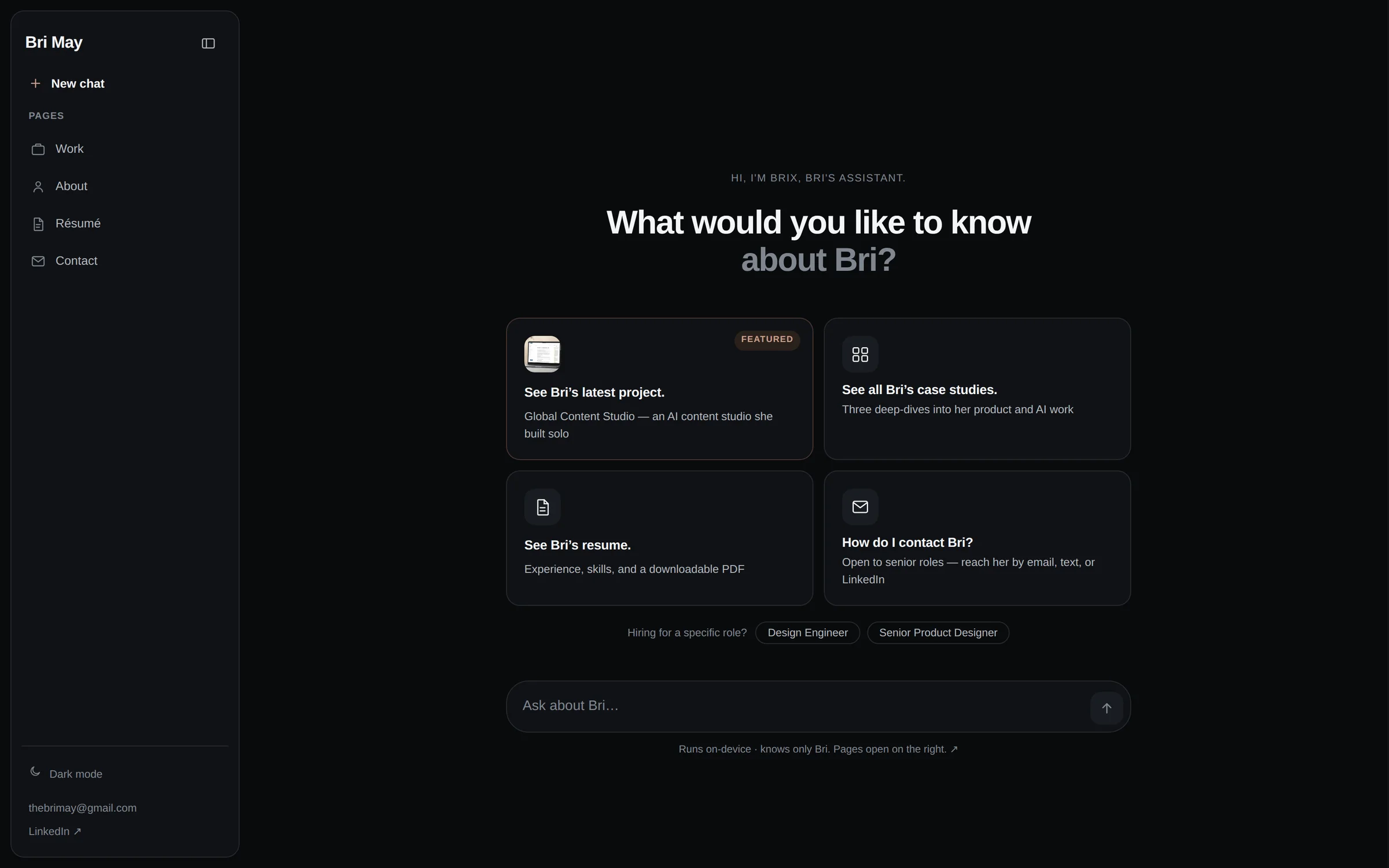
One token system, two faithful themes
Every color on the site flows through custom properties defined three times: light, system-dark, and a manual toggle persisted to localStorage and applied in <head> — so there's no flash of the wrong theme. The muted-text ramp is recomputed per theme at the same hue so hierarchy survives: worst-case contrast is ≥ 4.5:1 against both the page and card surfaces, in both modes.
Streaming a screen reader can live with
Token-by-token streaming mutates the DOM ~90 times per answer — inside an aria-live region, that's 90 announcements. Here, the thread streams silently and a separate polite live region announces the finished answer exactly once: measured, one mutation per answer. Chat UIs almost never get this right; it's the kind of invisible correctness I care about shipping.
Works with JavaScript off, fonts blocked, or 320px wide
The reveal animations are scoped to an html.js class, so a no-JS visitor (or a crawler) gets the complete content, and the homepage ships a full <noscript> version. Images declare intrinsic dimensions so nothing shifts as they load; videos open on hand-picked poster frames; the heavy case-study art is WebP. The deploy went from 130 MB to 51 MB without losing a pixel that matters.
Audited like a product, not admired like a page
The build loop was design-in-code: ship a slice, then attack it. I extracted the retrieval engine into a test harness and ran 38 questions a FAANG screener actually asks — the first pass answered 20 and routed "show me her strongest case study" to my college degree. Word-boundary matching, negative keys, and 19 new knowledge entries later it answered 37, and the last one routed correctly. The harness has since grown to 50 questions, including what-broke and architecture questions, and answers 49. Then a scripted browser drove every page: network, overflow at four widths, contrast in both themes, keyboard order, live-region mutation counts, downloads.
"If the site claims I can design and build, the site has to survive the person who checks."
Impact
Every claim on this site is one DevTools tab from proof.
Browser-verified checks green — network, layout, a11y, engine, downloads
Lighter deploy after the asset audit — 130 MB → 51 MB, WebP + poster frames
Servers, API keys, and dollars per answer — and it works offline
This site is the working sample: product framing, interface craft, a hand-built engine, measured accessibility, and a ship-then-audit loop — by one person. The same loop I'd bring to your team.