03 · Content
Organized by the problems people bring
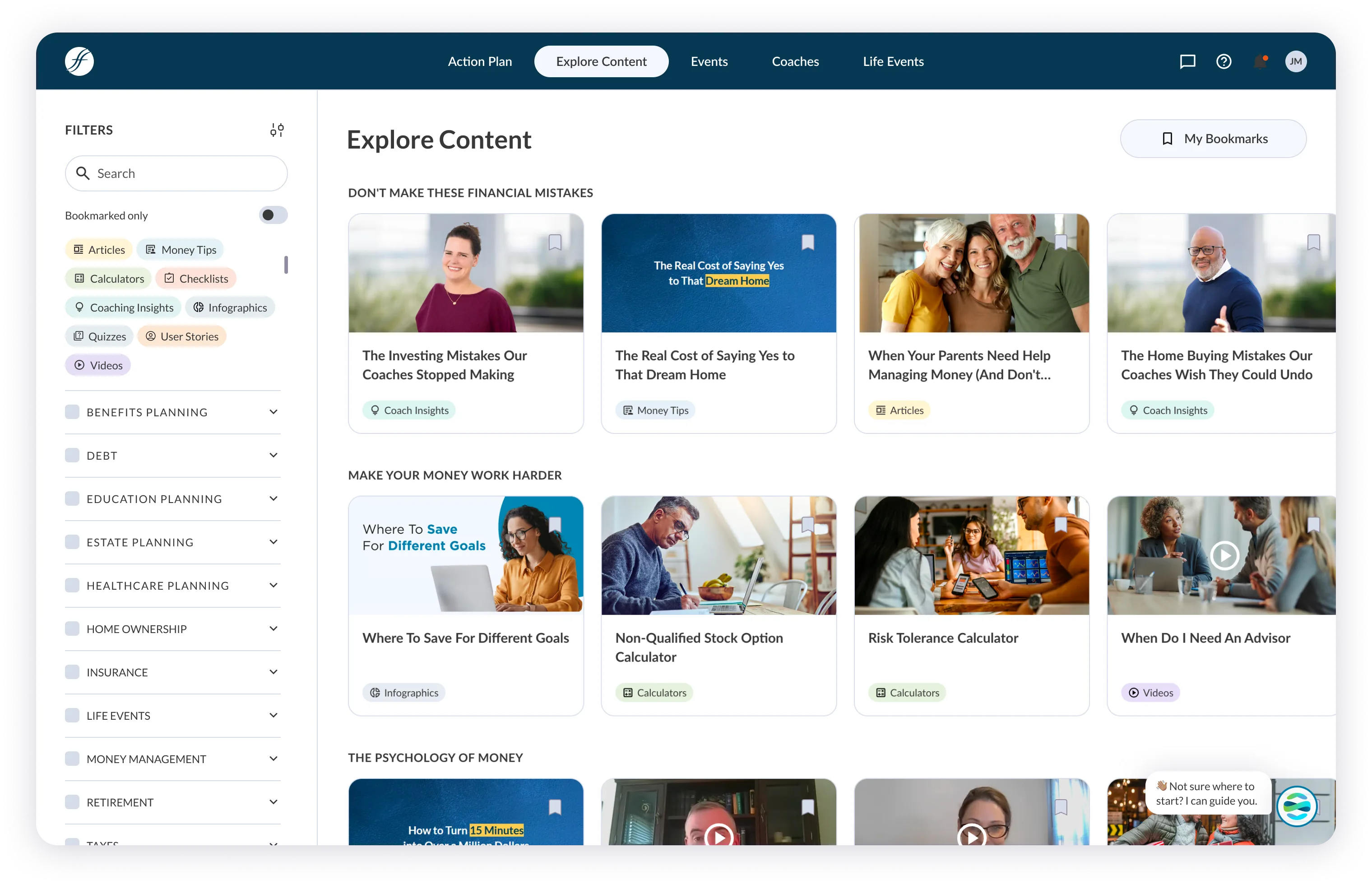
Rows like "Don't make these financial mistakes" mix articles, calculators, and videos, so the right next thing can be any of them.
The Hub was a library that made members do the work. In 2024 I led its redesign from research through launch: a short assessment, a personal action plan as the home screen, recommended content, and a coach within reach.
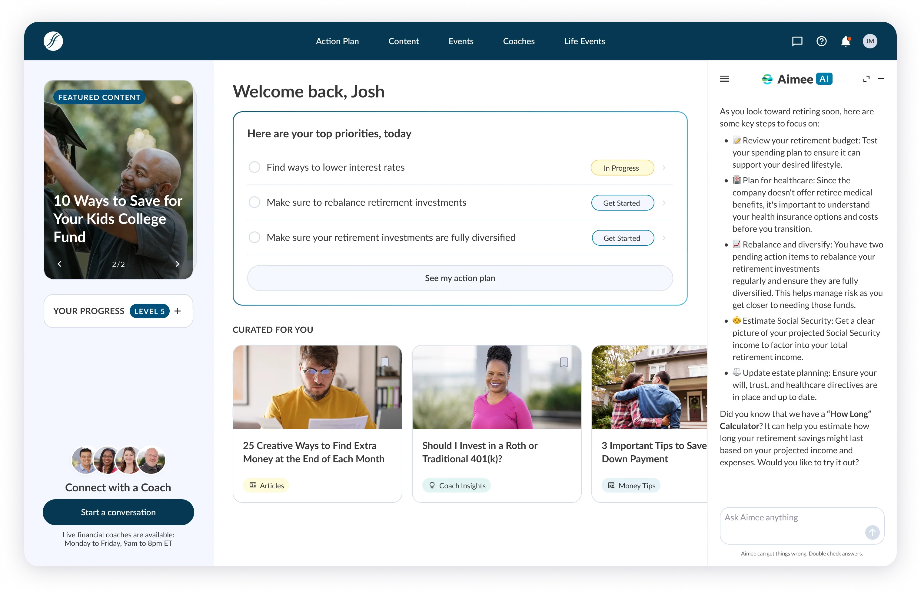
The redesign gave them a starting point: answer a few questions, get a plan, see the next action, and reach a coach from any page.
A static library with no starting point, no personalization, and no next step. Reading an article isn't the outcome; doing something about your money is.
Build the product around the member's plan, not around the content.
Lead Product Designer: strategy, design direction, the cross-surface design system, and the flows, from research through launch.
Product, engineering, and enterprise account stakeholders
From the current Hub (2026). The assessment, plan-first home, and curated content are the structure the 2024 redesign set.
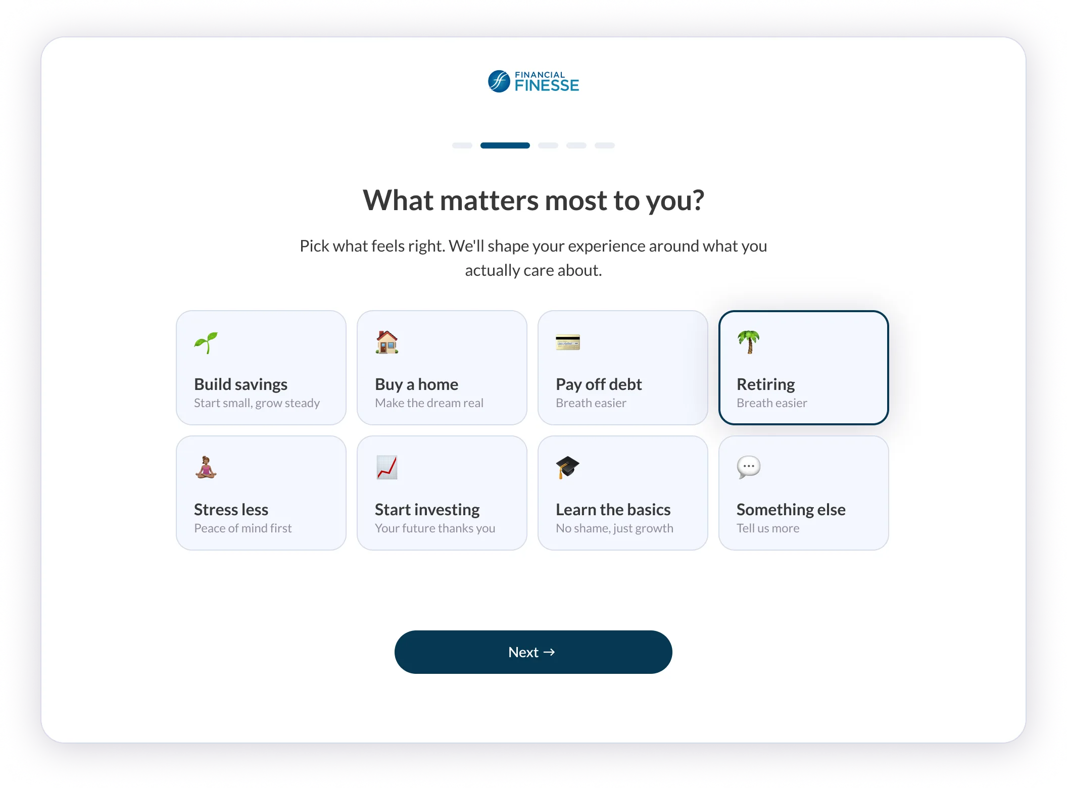
A short assessment replaces the generic welcome. By the time a member reaches home, it's already about them.
Rows like "Don't make these financial mistakes" mix articles, calculators, and videos, so the right next thing can be any of them.
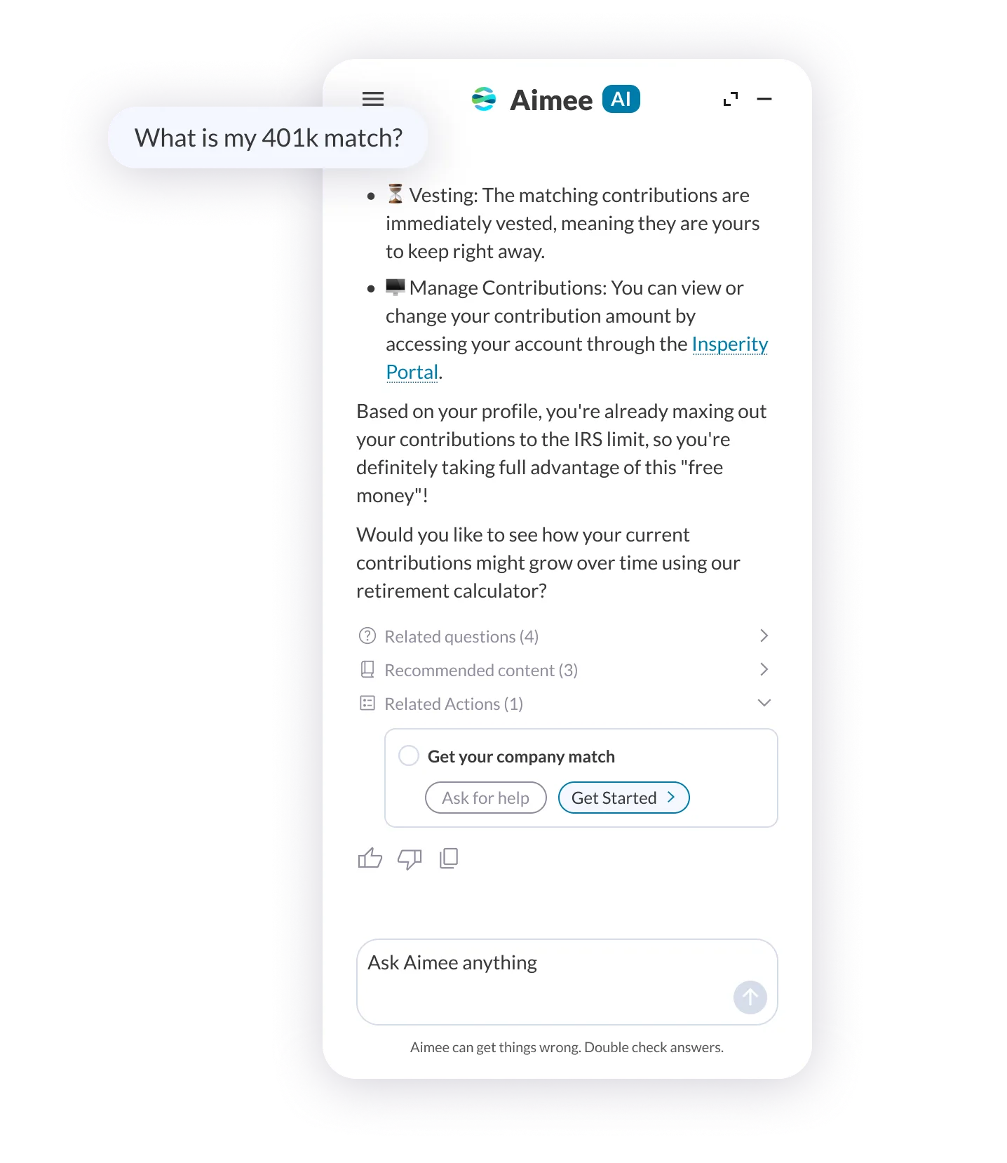
Built on the 2024 plan structure, not part of it. Aimee answers inside the Hub, then offers a step the member can add to their plan.
Not a visual refresh. The redesign had to change what members do next.
The information architecture follows the member's plan instead of the content catalog.
A cross-surface design system kept web and mobile consistent and fast to ship. The later Aimee and Studio work built on it.
Design led from research through launch with product and engineering, close to enterprise clients the whole way.
Platform engagement after launch, per internal reporting
Flows shipped: assessment, action plan, recommended content, coach access
Design system across web and mobile
The event counted, the baseline, and the window behind the engagement figure aren't published here, and engagement isn't the same as a change in members' financial behavior. The research that shaped the redesign isn't published either, so I don't quote findings from it.
The Hub went from a library members had to search to a plan that tells them what to do next. The AI work that followed was built on that structure.